The Key Things You Must Do to Increase Sales for your Ecommerce Store
Discover the key steps to optimize your ecommerce website and increase sales. From website design to product presentation, learn the essential strategies to boost conversions and drive revenue.
In the world of e-commerce, conversions (in this context, the process of making a sale) are everything. In fact, conversions are everything in any kind of business, as no matter how much money you’re spending on advertising, no matter how many prospects you’ve got coming through your door or onto your website, if none of them convert to customers then it’s just a matter of time until your business fails. Making sure that doesn’t happen starts with your store, whether physical or otherwise: you need to make sure it’s optimised to drive the people who visit it to actually convert to a sale. In this article I will discuss some of the main ways in which you can optimise an online store for conversions, whether you’re using Shopify, WooCommerce, Squarespace or some other e-commerce platform.
Why conversion optimisation is essential
Before I begin, I want to address a common objection to conversion optimisation that e-commerce store owners often throw at me: what’s the point of optimising my website until I get visitors? The common assumption is that investment in advertising to drive traffic should come first, because without sales you will have no revenue to invest in optimisation. This is only partly true. While it is accurate that you will need traffic to your website in order to properly optimise your conversions, your cost per acquisition will be significantly higher if you’re driving traffic that struggles to convert. This is perhaps easier to demonstrate with a scenario:
- Scenario 1: you spend £100 on advertising and 10 people visit your website. Of those 10 people, 2 make a purchase, while the other 18 get put off by your website’s navigation and leave the site. Your CPA (Cost Per Acquisition) is therefore £50. In other words, you need to spend £50 to make one sale. Each of your customers needs to spend more than £50 in order for this to be profitable.
- Scenario 2: you spend £100 on advertising and 10 people visit your website. Your website is fully optimised and easy to use, so 5 people end up making a purchase. Your CPA is now £20, and your customers now need to spend only £20 or more to be profitable.
- Your average purchase value is £45. In the first scenario, you will lose £5 on every sale due to your higher acquisition cost. In the second scenario you will be making a profit of £25 on every sale. Scale that up and the problem becomes more apparent: if you spend £10,000 per month on advertising, in the first scenario you will realise a loss of £1000 per month (-£12k per year), while in the second scenario you will make a profit of £12,500 per month (+£150k per year).
This couldn’t be any clearer: without optimisation you lose money and slowly go out of business, while in the second scenario your business flourishes. Same ad spend, radically different outcomes. If your marketing budget is tight - which it often is in the early days of business - one of the most sensible things you can do is invest time in making sure every penny you spend has the best chance of leading to a sale.
And so, with the significance of this hopefully drilled in, let’s move on to the fundamentals you need to have in place.
1. Use a professional, modern website design
This may seem obvious, but one of the biggest conversion-killers for e-commerce stores is poorly designed websites. The reason is quite simple: trust. Potential buyers are going to be expected to hand over their sensitive credit card information and likely don’t know your company (unless you’re Amazon, in which case hi Jeff!). They will be on high alert for any signs that your website is likely to scam them or mess up their order, and a poorly designed website conveys entirely the wrong message in this regard.
Ensuring a professional look and feel doesn’t necessarily mean spending thousands on a professional web designer, it starts by using a well-made theme if you’re on a platform like Shopify, Wordpress or Squarespace and - crucially - not messing the theme up with your own customisations. I cannot emphasise this enough. The theme designers have invested time to make sure the site’s going to look good, don’t break their good work. There are many free or extremely cheap themes for all the main platforms so there is no excuse for a badly designed website at this point.
In addition to a good theme, you should also include certain specific things that engender trust:
- An About page. Because your potential buyers are likely to be unfamiliar with your brand, including an “about us” page is essential. Tell the story of your business, show your face as the founder, and make it personal. This will not only instil trust but also help potential buyers to connect emotionally with your brand, encouraging them to want to buy.
- Ensure your branding is consistent. In most businesses, branding is somewhat secondary in the early stages but for e-commerce its importance is slightly more elevated. If you don’t have a great brand then keep it as simple as possible; you’re better off having a really basic but clean brand than a badly-made and inconsistent one that confuses website visitors and makes you look amateurish, which will damage trust.
- Terms and privacy pages. Often neglected by first-time e-commerce store owners, ensuring you have robust privacy policy and terms and conditions pages are absolute essentials for installing trust. You can either download a template from a service like Rocketlawyer or use a service like Termly.io to automate it for you. I personally recommend the latter as it keeps terms up to date automatically for you, albeit at a higher ongoing cost.
- Mobile responsiveness. This should go without saying nowadays, but if your site doesn’t work well on mobile devices then you will lose a lot of business. When choosing your theme, make sure to test it out on a mobile phone first or use a service like Google’s Mobile-Friendly Test to check its mobile performance. See the next point for more on this.
2. Optimise your product pages
If people are landing on your product pages but not buying, there’s a problem. The exact nature of that problem can be one of many factors, but here are the main ones to consider:
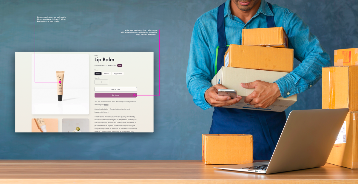
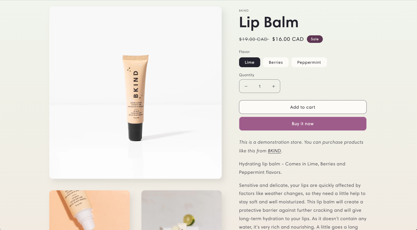
- Ensure the product images are high quality. Not just in terms of photo resolution or professionalism, but also in terms of how they present the product’s main features in a clear and appealing way. For example, if you’re selling wallets you want to make sure you have at least one high resolution photo of the inside of the wallet.
- Keep the purchase button clear and simple. Don’t try to get creative with the main call-to-action button. Keep it simple, make sure it stands out by using a good contrasting colour, and keep the text something familiar like “Add to cart”. You don’t want people to have to think when they’re on your page, so stick to what people are used to on other e-commerce sites.
- Write good product descriptions. I know this is tedious, but good product descriptions that explain the benefits and key features of your product can really make or break a purchase decision. There are tools to help you with this nowadays, including ChatGPT which can automatically write product descriptions and save you huge amounts of time. Good product descriptions are also important for boosting your store’s search engine visibility so don’t let this one slip.
- Make sure the product page is mobile friendly. According to recent stats, over 50% of all e-commerce purchases during the 2022 holiday season were made on a mobile device. If your product page is not optimised for mobile you are therefore losing potentially half of all your potential sales. This of course applies to the entire website as mentioned in the previous point.
- Add reviews of your product, if you have them. Social proof (aka reviews) are one of the best ways of converting sales. If you have reviews on a per-product basis then make sure to display these in a prominent position on the product page. If you have general reviews of your store, use those instead on your product page.
- Make sure the price is clear, and right for your target customer. If you have implemented all of the above and are still not getting sales, it may be the price. Two main things can kill sales when it comes to pricing: unclear prices and overly high prices. Clarity in pricing can sometimes be lost with products that have multiple variants and/or customisation options, so you need to make sure you work at presenting the price variations in as clear a way as possible, and always show the total price that will be added to the user’s cart when they click the button (nobody likes unexpected fees in the checkout phase). As for prices that are too high, first make sure you are benchmarking yourself against the competition - believe me, your potential customers will be - and if your prices are higher for a reason, make sure to explain clearly what that reason is, either in the product description or the website’s overall messaging.
Again, most of these issues can be quickly addressed by making sure you choose a high quality theme for your website in the first place, but it’s worth checking in on the basic details regardless.
3. Streamline the checkout process
People are loving your products and adding things to their basket, but when they go to the checkout page, they drop off. One of the most common problems we see at Growthmode in this regard is poorly designed checkout flows. Here are some simple rules of thumb to minimise that:
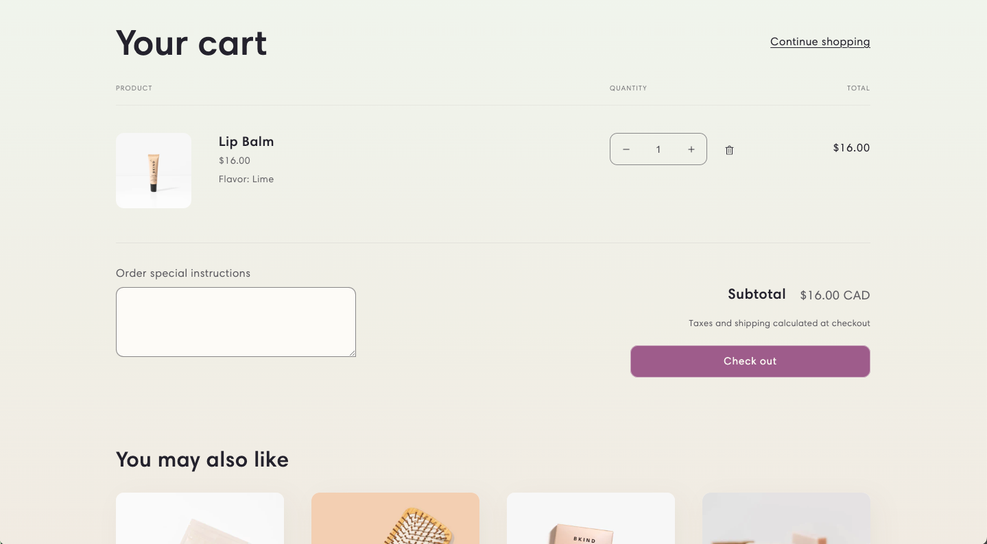
- Minimise clutter on the cart page. The point of the shopping cart page is firstly to confirm the products you intend to buy and verify the total cost, and secondly to make adjustments if needed before proceeding to the checkout. The only other acceptable thing to have on a cart page is upsell items, aka “you might also like…” product suggestions. But nothing else, aside from a clear button to proceed to the checkout. Here is a perfect example, with nothing but the products in the cart, a quantity editor and some upsell products:
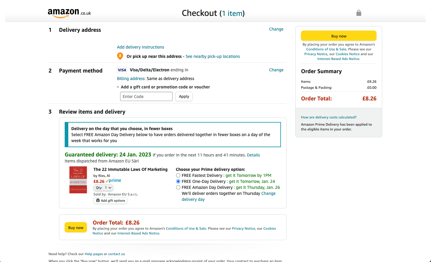
- Reduce effort on the checkout page. If your customer has got to the checkout page, you want to make it as easy as possible for them to complete the purchase. Think about shopping in a physical store; when you’re at the checkout all you want to do is pay as quickly as possible and leave with your goods. Now imagine if, before you could hand over your credit card, you had to fill out a bunch of forms and create an account with the store. Obviously that would be intensely irritating, yet this is extremely common on e-commerce sites for some reason. You should only have forms for the minimum information you need to fulfil the order, usually just the shipping address and credit card details. Do not insist on them creating an account unless absolutely necessary, and don’t break the checkout process up into multiple pages unless you have a really good reason to do so. Amazon is the world’s largest e-commerce platform and their entire checkout process is on a single page:
- Don’t add extra hidden costs at the checkout. Related to the previous point, nothing puts buyers off more than getting all the way to checkout and discovering that the price they thought they were going to pay is actually higher due to extras such as shipping costs, credit card fees and so on. Add these up front to the cart page or, even better, bake them into the prices if you can (particularly credit card fees). At bare minimum, tell people early on that shipping fees will be added at checkout so it does not come as a nasty surprise.
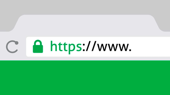
- Make sure your website is properly secured. Security is an absolutely essential requirement online these days, and a poorly secured website will put your buyers off instantly. Ensure you have a robust and up-to-date SSL certificate on your website so that the lock icon appears in the browser bar:
The easiest way to do this is through your website hosting provider. If you’re using a platform like Shopify or Squarespace the SSL certificates are automatic, and if you’re using your own platform with a framework like WooCommerce then use a hosting provider like WPEngine or Flywheel who also make it really easy to secure your website. If you have a custom built website, Cloudflare is your best bet for enforcing SSL (as well as many other excellent benefits).
- Make the credit card transaction process as smooth as possible. Finally, if the customer is ready to pay then make sure you don’t stand in their way. Use a modern, slick payment gateway like Stripe to make the process as easy as possible for them and steer clear of lesser known payment gateways with clunky or outdated interfaces. People are most insecure about giving away their card number so attention to detail at this step is critical, and with how easy it is to implement solutions like Stripe there is really no excuse nowadays.
4. Add social proof
I have already touched on this in the product page section, but social proof in the form of customer reviews is a really powerful and important conversion tactic for any e-commerce site. Collecting and promoting your (hopefully positive) customer reviews should become an integral part of the running of your business. There are many ways of implementing this, including:
- Sending customers a feedback request email. A few days after a customer’s order has been shipped, send an email asking them to review the product. This can be automated with marketing automation tools like the ones included with Shopify, or Wordpress plugins like AutomateWoo for WooCommerce. This is a great way of capturing feedback for specific products as well as your store in general.
- Adding customer review links on the final order confirmation page. After your customer has completed their purchase they should be sent to a final confirmation page thanking them for their business. This is a great place to ask them for reviews of your store as a whole, either by providing a link to a form or an external review site like the ones mentioned in the next item on this list.
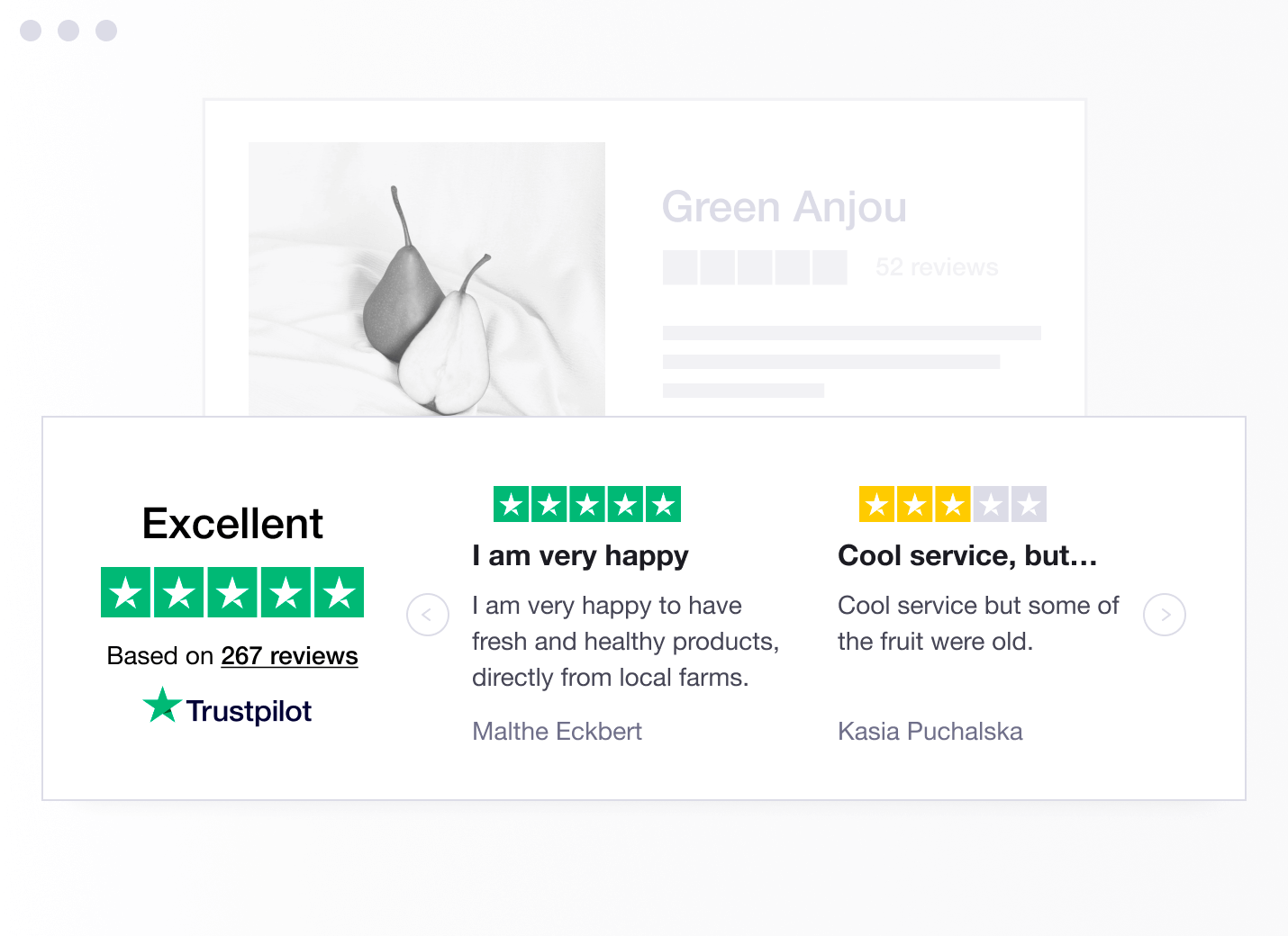
- Use a service like Google Reviews or Trustpilot. You can outsource the entire reviews system to a platform like Trustpilot or Google Reviews and then embed your reviews from those websites into your own site. The benefits of using sites like these are that they take care of much of the trust aspect for you, as customers already know and trust these platforms and understand that there is a certain amount of verification with reviews that may not be the case with your own website (i.e. the reviews are less likely to be fake). There is also an SEO benefit to using these platforms as they will rank more highly than your own website and will pop up in the results if your potential customers search for whether or not your website can be trusted.
5. Shopping cart abandonment
So a potential customer has added products to the cart, gone to checkout, entered their details but never completed the purchase. Why not? It could be for a number of reasons, some of which are included in point 3 but also others which are totally beyond your control such as the customer getting distracted before they could complete the purchase, their internet dying halfway, misplacing their credit card, or just getting cold feet at the last second. Rather than guessing, why not just address them directly? There are two main ways of doing this:
- Cart abandonment emails. If the customer has entered their email already before abandoning the purchase process, you can use that to send them an email with a reminder of what was in their cart and a link to complete their purchase. This can be automated using the same marketing automation tools mentioned in the previous point, or you can take it further by using dedicated services like Omnisend.
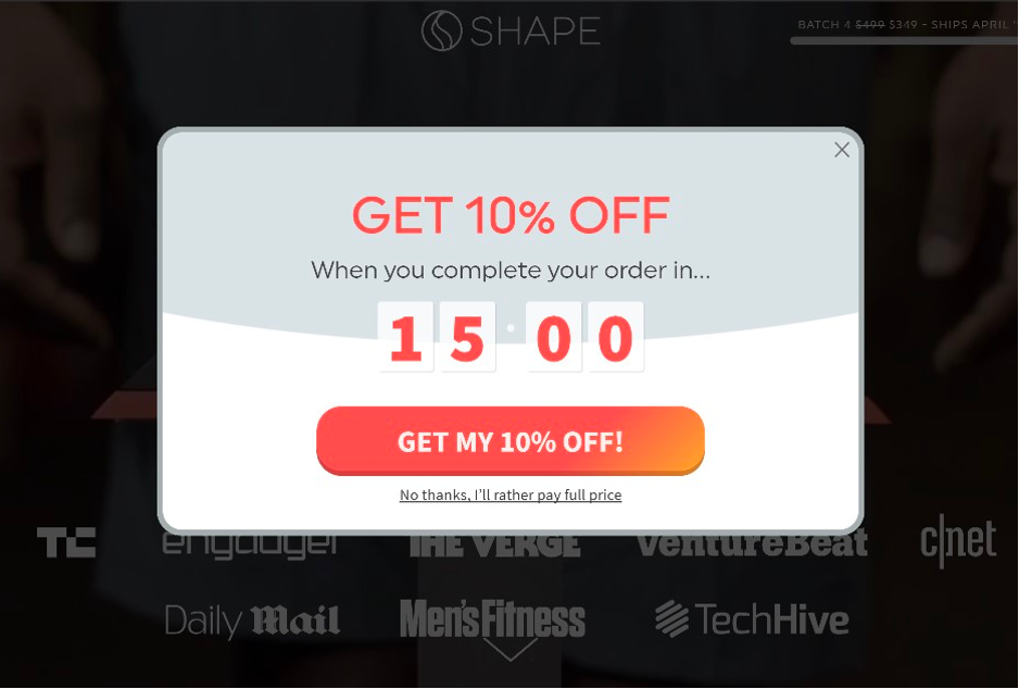
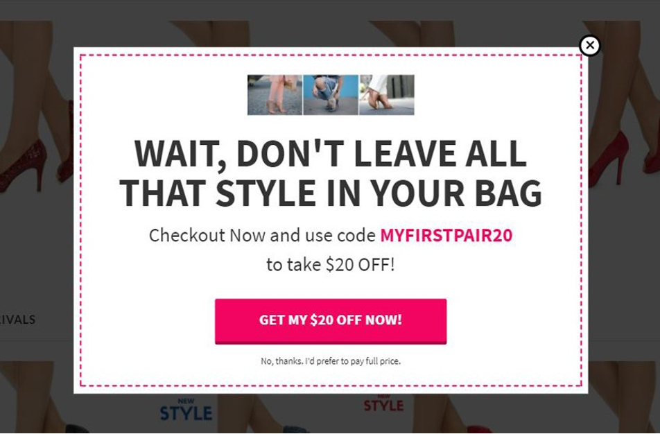
- Cart abandonment popups. If you are unable to capture the email address first, you can instead use a popup that shows when the customer performs an “exit intent” action. In plain English this means tracking the user’s mouse movements and if their cursor moves towards the browser back button, that is a signal that they intend to exit your website - an “exit intent”. Upon detecting such an action, you can have your website show a popup to try and dissuade them from leaving. A discount offer with a countdown is a good option:
Or a simple reminder that they still have items in their cart:
Conclusion
Addressing these five key areas will make sure that your store is doing its absolute best to help interested users complete a purchase, or at very minimum not get in their way. Beyond conversion optimisation you need to start focusing on getting the right people onto your website, which is a whole topic in its own that I will cover in a future blog post.
For more advice on how you can increase sales for your e-commerce store, subscribe to our blog below, check out our constantly growing tactics database, or get in touch with us, we’d be happy to review your site for free.